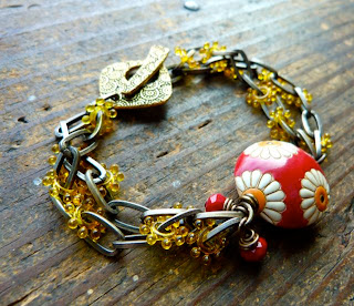
Red, Yellow, Green
Two things are clear lately. After creating pieces for our upcoming book, I realize I use entirely too much green in my work.
So this weekend I break out of the green shell I'm in and start using colors I wouldn't normally.
Such as lemon yellow. And red!
But here's the thing. Green seems to appeal to buyers more than yellow or red. At least this is true for me.

Or maybe yellow and red together, don't appeal to buyers. Or maybe it's a seasonal color palette that would sell in the Summer but not the dead of winter.
I just find the whole color palette science interesting.
Speaking of Color Palette science, have you seen Brandi's Color Palette blog walk happening? You should check it out! I saw a participants list this morning over at Cindy's blog.
I'm going to play around with this tool and make my own color palettes today. Brandi posted instructions at her blog here.

I love orange, but my customers do not!!! So, I tend to make a lot of greens, blacks, and browns.
ReplyDeleteWhat sweet bracelets!
ReplyDeleteRed takes forever to sell for me, so I've stopped using it for the primary color in my pieces and try to use it just for contrast.
Lorelei, what an interesting post. It sparks off loads of questions, thoughts and wonderings in my head.
ReplyDeleteI believe you are right about yellow being less appealing to people. And perhaps green being more appealing. I never thought about it that way. I just know I am a big fan of green myself.
It is fun to use "difficult" colors to challenge yourself. I've done the same before. I think I should have a go at it again just to push myself a bit. I need that.
Thanks for sparking me off, and for showing your new and nice bracelets.
I'll keep thinking about this post for a while on now, I'm sure. I might even end up writing something on my blog about my own thoughts on the subject. Like soonish. Color palettes - color science - color palette tools - schemes - Maggie Deeb - color of the year - honeysuckle - and so on.
Now I'm off to check the links you included.
Bye for now,
:-)
Hi Lorelei! Yes I too tend to stay in certain colours. Nothing wrong with a change and busting loose lol. Nice yellow and red bracelet!
ReplyDeleteI do like that yellow and red combo but I must admit that I am always drawn to green and blue. I'm going to try out that palette tool. Thanks for the link.
ReplyDeleteI tend to work in too many green and aqua colors too. But they do sell more than the others. Blue against brass and coppers are great and I've heard more than once that " it goes with jeans , therefore I can wear it more often!"
ReplyDeletethe greens are such friendly colors, they go with all most anything..think of a flower..the bloom may be brilliant but the stem and leaves are usually green..
ReplyDeleteLovely bracelets but I too am more drawn to greens and blues and all things in between! However, I'm also a big fan of orange-pink spectrum - in fact, I've got a lovely necklace of yours - simple ceramic and lucite beads strung on a brass chain in pinks/purples/peaches. And also, one of my favourite bracelets is by you - a Jade Scott pear charm on red and yellow knotted seeds with two turquoise jade briolettes! So perhaps you just need to keep mixing the blues/greens in for good measure!
ReplyDeleteBeautiful. I love them both. I wouldn't have guessed you don't normally use the colors(if I didn't know you ;)
ReplyDeleteYou know they use yellow and red for food things like fast food restaurants. I forget what the whole deal is behind it, but maybe it will have the same positive appeal to your customers ;)
I love that red and yellow bracelet. I just bought very similar beads last weekend, a bag full of red and yellow goodies and some great red glass beads with yellow daisies on them. I too am a freak for orange.
ReplyDeleteI have an appallingly serious addiction to green and blue...my primary goal in clothing shopping for the past several months has been to buy things that don't look like everything else in my closet...I need to extend that to my creative life too!
ReplyDelete