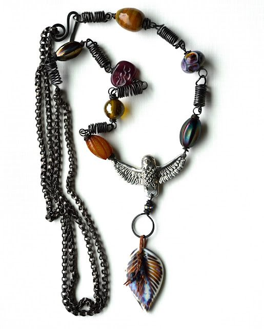
Bigggg pictures
I'm just playing around a little bit with blog design today. I have always wanted to showcase my photos on the largest scale. I like it. But I do lose the side bar.... it's now at the bottom of the blog. How do you feel about that? If you have an ad, I assume you would not like this layout. I'm curious, if you have an ad, is it still generating traffic? If you are a follower without an ad, how do you like seeing the image bigger.
Tap tap tap....
Is anyone out there?
(PS- The image is now changed to the extra large pre set size) Can you see it on your phones now?)

I do like the larger format of your photo but I cannot see the entire piece at one glance, I have to scroll thus I don't think i get the full impact of your design. perhaps not quite so large but not as small as before, if you can tweak it that much. I know on blogger I get three choices, tiny, not so tiny and omg that's huge.. lol
ReplyDeleteI like your new photo by the way, very lovely. and I don't mind it being at the bottom.
I agree with Deb... It's problematic to not be able to see the whole image at one time. I like blog photos to be large enough that I can see the details (we've all seen folks use photos where you really can't see things well due to small size) but small enough that I can see the entire pic at once. Love the necklace though! :)
ReplyDeleteI agree with Deb and Sarajo.though I love the idea. I love the piece and I love your blog header.
ReplyDeleteIt's much better to be able to see the whole picture and this one is too big even for a larger monitor like mine. Even though it's a great photo and we can see all the little details.
ReplyDeleteHow about now.... I just changed the image size and now the side bar fits again.... still too big?
ReplyDeleteIs it optimized for the web? It is coming out very distorted when viewing it on my phone, and normally I don't have issues with viewing larger photos on my smaller screen. I do love seeing your photos on a white background, but then all of your photos are very pretty.
ReplyDeleteI love it. I am using my Samsung Galaxy Tab 10.5, if that helps you. The photo is great. When I scroll through previous posts, the photos now seem too small with no definition. This piece is beautiful.
ReplyDeleteMe again, the photo also looks better on my bloglovin feed.
ReplyDeleteIt still doesn't fit within the monitor but is much better and can be viewed in its entirety at 80%. But, like I said, my monitor is pretty big at 24 inches.
ReplyDeleteThis comment has been removed by the author.
ReplyDeleteI think the picture is distorted only when viewing the mobile version of your site because when I switch to the web version it looks great.
ReplyDeleteI think your blog is gorgeous! I liked it before, but I really like it now. So clean and bright!
ReplyDeleteOn my phone, it's distorted unfortunately.
ReplyDeleteFirst of all, I absolutely love your header. The photo of the hydrangeas is gorgeous and I admire it whenever I read your blog. I would rather see the photo of the (beautiful) necklace all at once rather than scroll down.
ReplyDeleteIt's very distorted on mobile devices, if you desided to run with this be aware that the younger generation has almost completely bypassed desktops and is probably about 90% on mobile devices, although larger photos are beautiful this would alienate any new follower stopping by your blog on a mobile device, pretty necklace though love your wire play!
ReplyDeleteIs it still distorted because i changed it back to the original size (extra large setting on blogger)
DeleteLooks perfect now! 😉
DeleteThis comment has been removed by a blog administrator.
ReplyDeleteThis comment has been removed by a blog administrator.
ReplyDeleteThe image is now changed to the extra large pre set size) Can you see it on your phones now?)
ReplyDeleteYes!
DeleteFirst off, the necklace is stunning! I viewed the necklace on my desktop and loved seeing all the details---like the white background. I know on the IPhone the photos are so small you don't get the same impact. This just popped off the screen of my computer.
ReplyDeleteThe extra large pre set size is perfect! Love the white background and all the detail. Your work is amazing!
ReplyDelete